

Case Study: Rough Draft
UX/UI Website Evaluation & Responsive Redesign
UX/UI Design · UX Evaluation · User Personas · Information Architecture · Wire-framing · Responsive Design
Project Overview
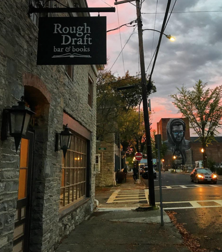
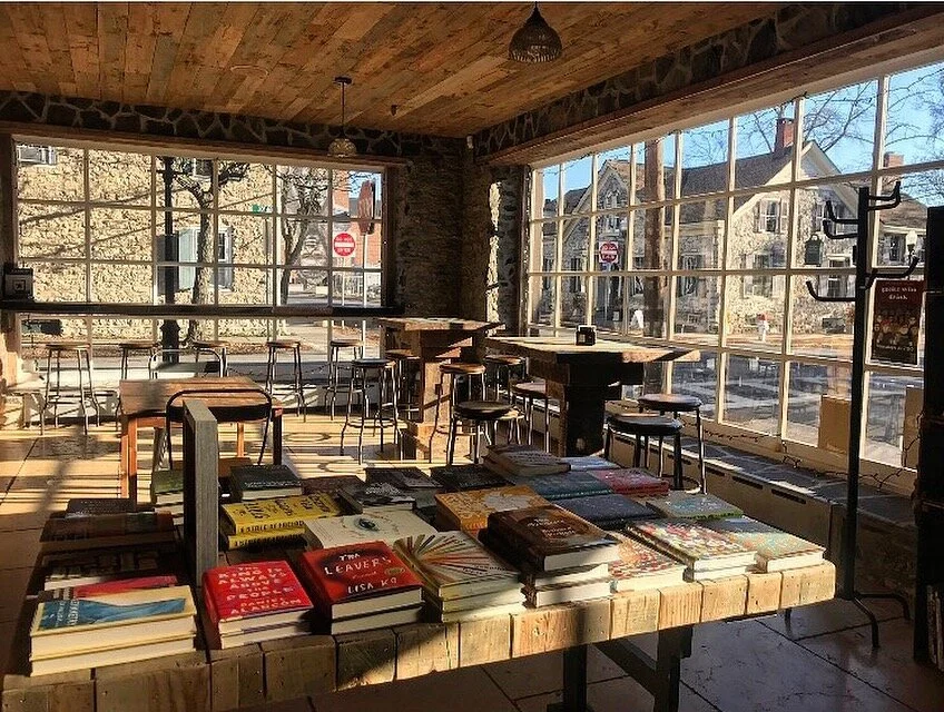
Rough Draft is a bookstore, café, bar, and event space in Kingston, New York. This project evaluated the existing website experience and explored opportunities to improve usability, visual hierarchy, navigation, content organization, and responsive design.
Role: UX/UI Designer
Project: Website Evaluation & Redesign
Year: 2022
Type: Academic / Independent Project
Tools: Illustrator, InDesign, Microsoft Word
The Challenge
Rough Draft had established itself as a distinctive community destination in Kingston, New York, bringing together a bookstore, café, bar, and event space. Its physical environment offered a welcoming, social atmosphere, with a diverse selection of books, community events, and opportunities for local engagement. However, the existing website did not fully communicate that same experience digitally.
Although the website provided essential business information and access to its services, the overall design lacked the visual cohesion and intuitive structure needed to effectively represent the business. Through an evaluation of the existing website, I identified several opportunities to improve how information was presented, how users navigated the site, and how the experience adapted across different screen sizes.
The central challenge was to bridge the gap between Rough Draft's engaging physical identity and its digital presence while making important information easier to discover, understand, and interact with.
Visual Hierarchy & Brand Experience
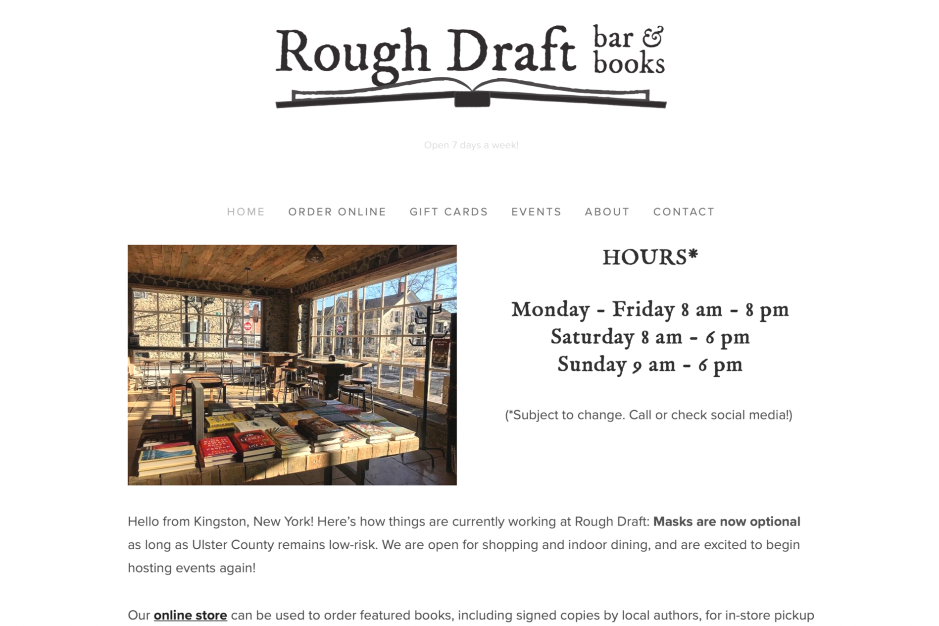
The existing website did not fully reflect the character or atmosphere of Rough Draft's physical location. The layout relied heavily on text, while imagery was often too small to establish a strong visual presence. Excessive negative space and inconsistent relationships between visual elements made the pages feel disconnected and reduced the overall impact of the content.
The challenge was to create a more intentional visual hierarchy that balanced imagery, typography, and written content while establishing a stronger connection to the business's identity.
Navigation & Information Architecture
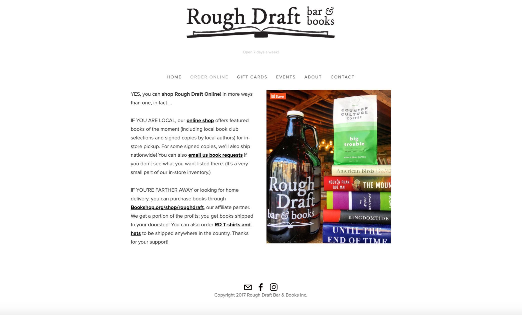
Navigation terminology and page organization were not always consistent throughout the website. For example, product-related navigation shifted between labels such as "Order Online," "RD Hats and T-Shirts," and "RD Merch." These inconsistencies could create uncertainty about where certain information or products could be found.
The challenge was to establish a more intuitive navigation structure, use recognizable terminology, and organize information in a way that aligned with user expectations.
Content Discovery & User Engagement
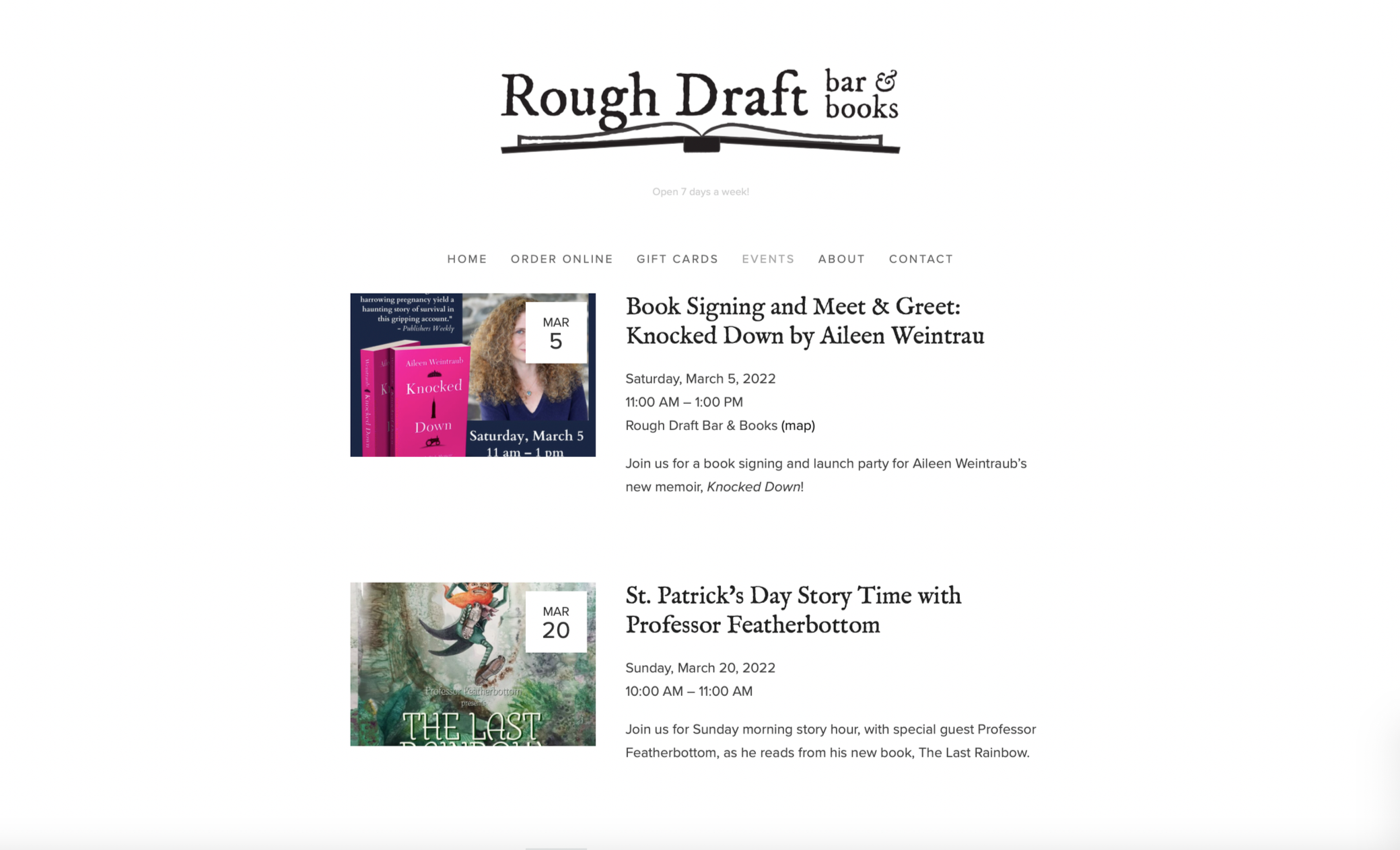
Important information was not always easy to locate or efficiently explore. The homepage presented multiple pieces of information without a particularly clear hierarchy, while the Events page relied on a vertically listed format that required users to scroll through individual events to understand what was happening.
Responsive Experience & Usability
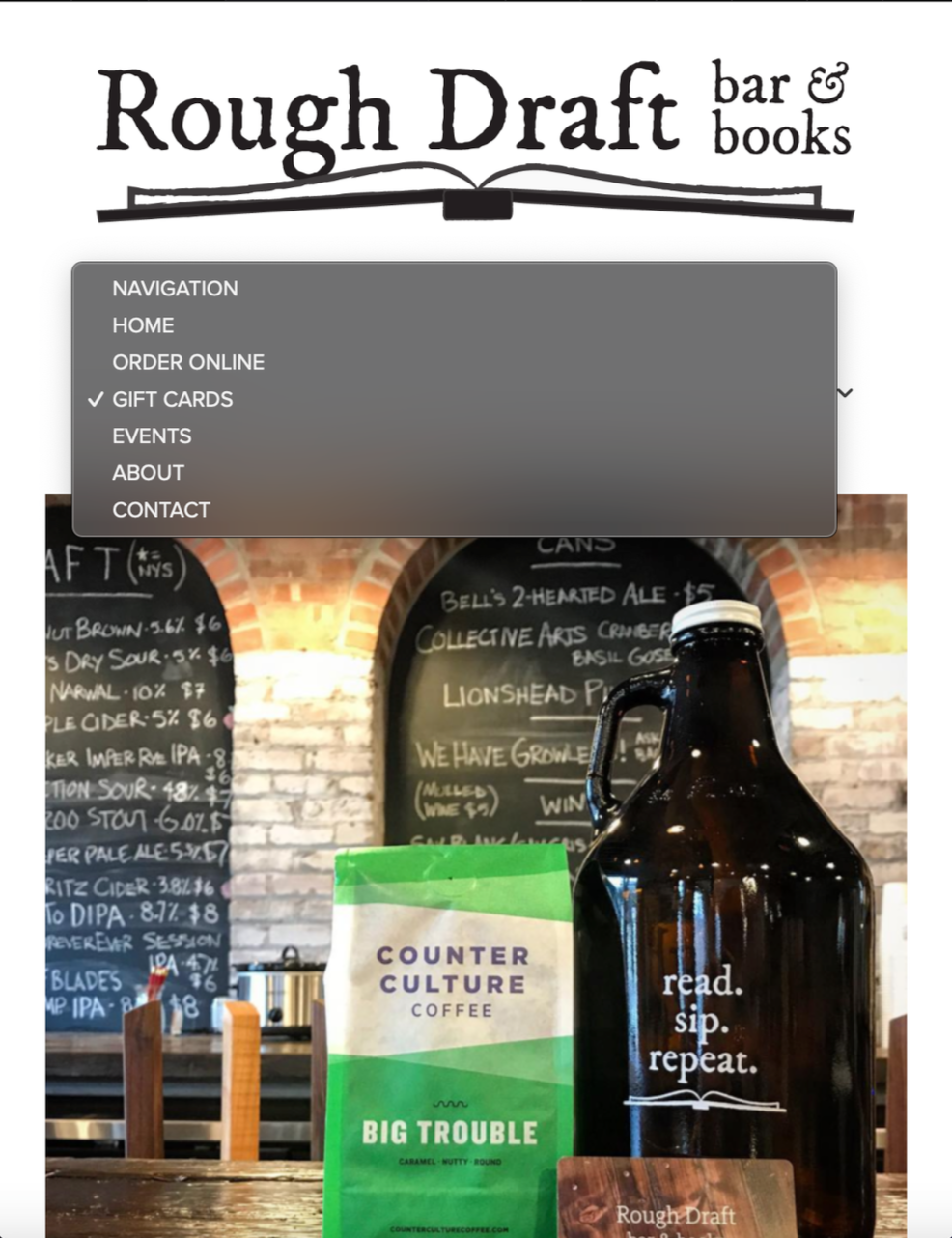
Although the existing website adapted to different screen sizes, the experience was not equally effective across desktop and mobile layouts. Some mobile elements introduced additional navigation inconsistencies, while the overall presentation continued to present challenges with content hierarchy and usability.
The challenge was to consider how users interact with the website across devices and create a more cohesive experience that maintained clarity, consistency, and functionality at different screen sizes.
Design Objective
The goal of the redesign was to create a more cohesive and user-centered digital experience that better represented Rough Draft's identity while making its content and services easier to navigate.
By addressing visual hierarchy, navigation, content organization, and responsive layouts, the proposed design explored ways to make the website more intuitive, engaging, and reflective of the experience Rough Draft offers its community.
Understanding the Users
I considered three different perspectives when evaluating the experience: a local customer, a visitor looking for things to do, and a potential business partner.

Laura
-
Goal: Discover books, community activities, and upcoming events.
Frustrations: Inconsistent information and difficulty finding event and book-club information.
Ideal experience: A more accessible event calendar and easier-to-find book-club information.

Flynn
-
Goal: Discover events and find a welcoming social environment.
Frustrations: The website felt visually bland and didn't reflect the atmosphere of the physical location.
Ideal experience: A website that better represents Rough Draft's social atmosphere and creative identity.

Joe
-
Goal: Explore the business and determine whether a partnership would be a good fit.
Frustrations: Limited product information, unclear event information, and a website that didn't feel sufficiently professional.
Ideal experience: A more professional digital presence that supports local partnerships
User Scenarios
To better understand how different visitors might interact with Rough Draft’s website, I developed three user scenarios based on the personas created for this project. Each scenario represents a different audience, with distinct goals and reasons for visiting the website.
The scenarios explore three common tasks: discovering ways to stay connected with the business, finding upcoming events, and researching products and potential business partnerships. By considering these experiences, I could identify where the existing website created unnecessary friction and where improvements to navigation, content organization, and usability could make the experience more intuitive.
What These Scenarios Reveal
-
Persona: Laura Sioux | Local Bookworm
User Goal: Find and sign up for Rough Draft’s newsletter and membership.As a longtime Kingston resident and returning customer, Laura wants to stay connected with Rough Draft and become more involved in the local community. With two young children, she needs to complete this task quickly without having to search through multiple pages.
When Laura visits the website, she initially looks for a newsletter or membership option on the homepage. Unable to locate it immediately, she navigates to the Contact page, where she finds the mailing list signup and social media links. Although she completes the signup quickly, she later discovers that similar options were also available farther down the homepage.
UX Opportunity: Make newsletter subscriptions, membership information, and social media links easier to discover. Important engagement opportunities should be visible and consistently placed so visitors can find them without unnecessary searching.
-
Persona: Flynn Paterson | Tourist
User Goal: Browse upcoming events and find something interesting to attend.As someone relatively new to the Kingston area, Flynn is looking for opportunities to become more socially involved and discover local events. After hearing about Rough Draft from a friend, he visits the website on his phone to explore the upcoming event schedule.
Flynn navigates to the Events page and finds a list of upcoming activities. However, the page does not provide a clear overview of the week or upcoming weeks. He must scroll through individual listings to understand what is happening, while brief descriptions and obscured event imagery make it difficult to determine which activities might interest him. Ultimately, the experience leaves him unsure of what Rough Draft has to offer, and he considers looking elsewhere.
UX Opportunity: Improve event discovery through a more organized and engaging layout. An interactive calendar, clearer event descriptions, accessible imagery, and a more useful overview of upcoming activities could help visitors browse events and make decisions more easily, particularly on mobile devices.
-
Persona: Joe Everte | Potential Business Partner
User Goal: Explore Rough Draft’s products and find contact information to discuss a potential partnership.As a neighboring business owner, Joe is interested in connecting with Rough Draft and exploring opportunities to support one another. Before reaching out, he wants to understand what the business offers, what products are available, and how to contact the owner.
While browsing the website on his desktop, Joe encounters several navigation and content inconsistencies. The online ordering and merchandise links lead to pages with repeated information or product categories that do not match their navigation labels. When he visits the gift card page, he is redirected to an external purchasing site and has difficulty returning to Rough Draft’s website.
Eventually, Joe locates the Contact page and sends an email expressing his interest in a potential partnership. However, the overall experience leaves him uncertain about the business's online presence and whether it communicates the professional image he would expect from a potential partner.
UX Opportunity: Create clearer product categories, more descriptive navigation labels, and a more consistent browsing experience. Contact and business inquiry information should also be easy to locate, while external links should provide a clear path back to the main website.
Although each visitor approaches the website with a different goal, their experiences point to several shared opportunities for improvement:
Clearer navigation: Help visitors understand where information is located and how different pages relate to one another.
Better content organization: Present relevant information where users expect to find it, without unnecessary repetition.
Improved visual hierarchy: Use typography, imagery, spacing, and layout to make important content easier to scan and understand.
More engaging interactions: Make it easier to discover events, explore products, and connect with the business.
Consistent responsive design: Ensure that essential information and navigation remain accessible across desktop and mobile devices.
These scenarios helped translate the initial website evaluation into practical design considerations, informing the direction of the proposed redesign.
UX Evaluation
Before developing the proposed redesign, I evaluated Rough Draft’s existing website to identify usability concerns, inconsistencies, and opportunities to improve the overall digital experience.
The evaluation considered the website’s visual presentation, navigation, content organization, and behavior across desktop and mobile layouts. I also applied selected principles from Jakob Nielsen’s 10 Usability Heuristics to examine how effectively the interface supported common user tasks.
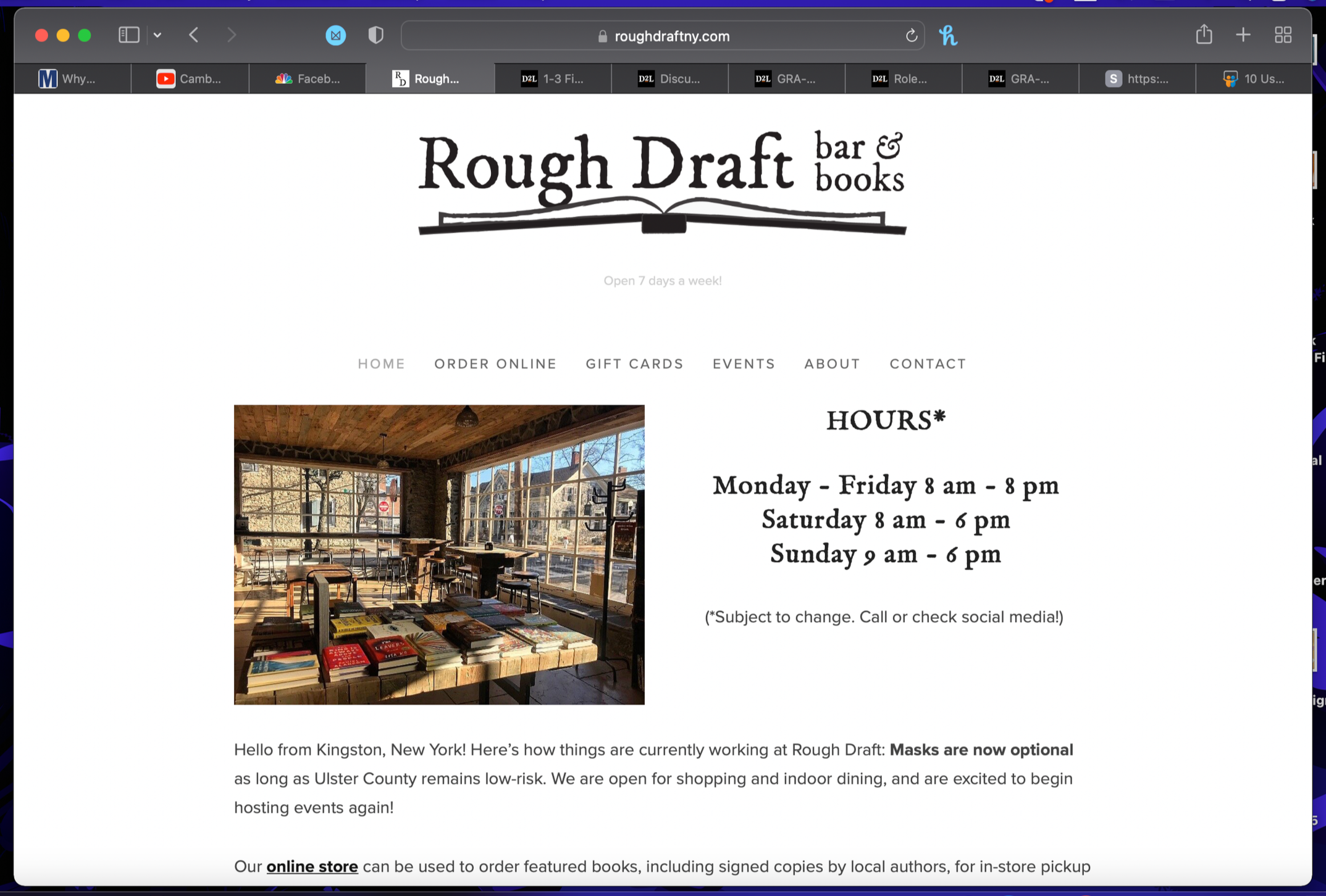
Although the website provided access to essential business information, several areas created unnecessary friction for visitors. The most significant findings involved how information was presented, how users navigated between pages, and how consistently the website communicated its content and functionality.
Key Usability Findings
Visual Hierarchy and Content Presentation
Excessive negative space weakened the overall composition of the homepage.
Small imagery limited the visual impact of the business and its offerings.
The relationship between text and imagery lacked consistency across certain pages.
Some pages contained repeated or lengthy information that could be presented more efficiently.
Navigation and Information Architecture
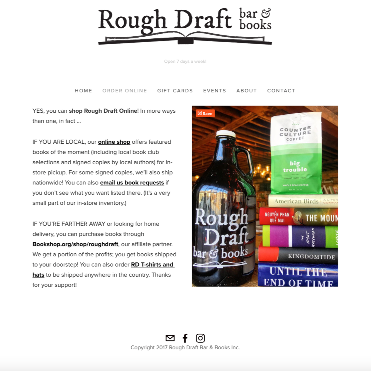
Some navigation labels did not clearly communicate the content users would find after selecting them.
Different names were used for related product and shopping destinations.
The external gift card purchasing experience interrupted the website journey and made returning to the original site less intuitive.
Event Discovery and Mobile Usability
The Events page relied on a vertically listed format that required visitors to scroll through individual listings.
Event descriptions provided limited information, while imagery was difficult to view clearly.
Visitors lacked an at-a-glance overview of upcoming events and the broader schedule.
Mobile navigation and content presentation could be more consistent and recognizable.
Evaluation Framework
I focused on three usability heuristics that were particularly relevant to the issues identified during the review:
Match Between the System and the Real World
Website language and organization should reflect terms that visitors recognize and understand. Rough Draft used internal or abbreviated terminology, such as “RD Merch,” without always making the product categories immediately clear. The visual hierarchy and organization of certain pages also made information feel less intuitive.
User Control and Freedom
Visitors should be able to navigate through a website without feeling trapped or losing their place. One example involved the gift card purchasing experience. Selecting the gift card link directed visitors to an external third-party website, where the Rough Draft branding no longer provided a clear way to return to the original site.
Consistency and Standards
Navigation labels, visual elements, and interactions should behave consistently throughout a website. Rough Draft used different terminology for related shopping destinations, including “Order Online,” “RD Hats and T-Shirts,” and “RD Merch.” The mobile navigation also relied on an arrow-style dropdown indicator rather than a more recognizable menu icon.
Evaluation Takeaways
The evaluation showed that Rough Draft’s website contained the essential information visitors needed, but the way that information was organized and presented could make common tasks more difficult than necessary.
The greatest opportunities were not simply aesthetic improvements. They involved making the website easier to understand, creating more predictable navigation, improving the visibility of important content, and providing a more consistent experience across devices.
These findings became the foundation for the proposed redesign, guiding decisions about page structure, navigation, content hierarchy, event discovery, and responsive layouts.

Design Opportunities
Design Direction
Together, these opportunities informed the direction of the redesign: a more visually engaging, intuitive, and interactive website that made it easier for visitors to explore Rough Draft, discover its offerings, and connect with the business.
The next stage translated these ideas into a revised navigation structure, low-fidelity wireframes, and high-fidelity interface concepts.
The UX evaluation revealed opportunities to improve how visitors navigate, discover information, and interact with Rough Draft’s website. Rather than making isolated visual adjustments, the proposed redesign focused on creating a more cohesive experience that balanced the business’s visual identity with the needs of its visitors.
The following opportunities established the direction for the redesigned website.
-
Opportunity: Create a more balanced relationship between imagery, typography, and written content.
The existing website relied heavily on text and did not make full use of its visual content. I saw an opportunity to create a more engaging layout by increasing the prominence of imagery, refining the use of spacing, and organizing information into clearer visual sections.
The goal was to make the website easier to scan while giving visitors a stronger impression of Rough Draft’s atmosphere and offerings.
-
Opportunity: Make navigation more recognizable, predictable, and easier to understand.
Inconsistent labels and navigation patterns made it difficult to anticipate where certain links would lead. The redesign presented an opportunity to establish clearer terminology, improve the organization of navigation links, and use more familiar interface conventions.
The proposed navigation structure also explored ways to make important destinations—including events, newsletter information, and site search—more visible to visitors.
-
Opportunity: Help visitors explore upcoming events without having to navigate through lengthy lists.
The existing Events page required visitors to scroll through individual listings to understand what was happening. I explored a more interactive approach that would provide a broader view of upcoming activities and make event information easier to access.
An interactive calendar was proposed to give visitors a clearer overview of the schedule, while improved event presentation would make individual listings easier to browse and understand.
-
Opportunity: Present useful information in a more concise and intuitive way.
Some pages contained repeated information or content that was difficult to locate. The redesign focused on reducing unnecessary text, organizing related information into more logical sections, and making important actions and destinations easier to identify.
A search feature was also explored as a way to help visitors locate information more directly, reducing the need to remember where specific content was located.
-
Opportunity: Better reflect the character and atmosphere of Rough Draft through the website’s visual presentation.
Rough Draft brings together several experiences: a bookstore, café, bar, and community event space. The website offered an opportunity to communicate that personality more effectively through a consistent visual language.
The proposed direction focused on creating greater cohesion between imagery, typography, layout, and interface elements so the digital experience would feel more representative of the business itself.
Information Architecture
After identifying the navigation and content organization issues within Rough Draft’s existing website, I began exploring how the site’s structure could be improved to create a more intuitive browsing experience.
The original navigation included several destinations, but the way information was labeled and presented made it difficult to understand where certain content belonged. For example, shopping-related links used inconsistent terminology, while important resources such as the newsletter and events were not as easy to locate as they could be.
The goal was to simplify the navigation, establish a more logical content hierarchy, and make the website easier to explore for both new and returning visitors.
Organizing the Navigation
I explored a revised navigation approach that gave greater visibility to the website’s primary destinations while creating a clearer visual hierarchy.
The proposed layout incorporated:
Primary navigation: Clear links to the main website sections, including Home, Store, Events, About, and Contact.
Newsletter access: A more visible destination for visitors interested in updates and community news.
Search functionality: A search option to help visitors locate information more directly.
Social media links: A consistent location for visitors to connect with Rough Draft outside the website.
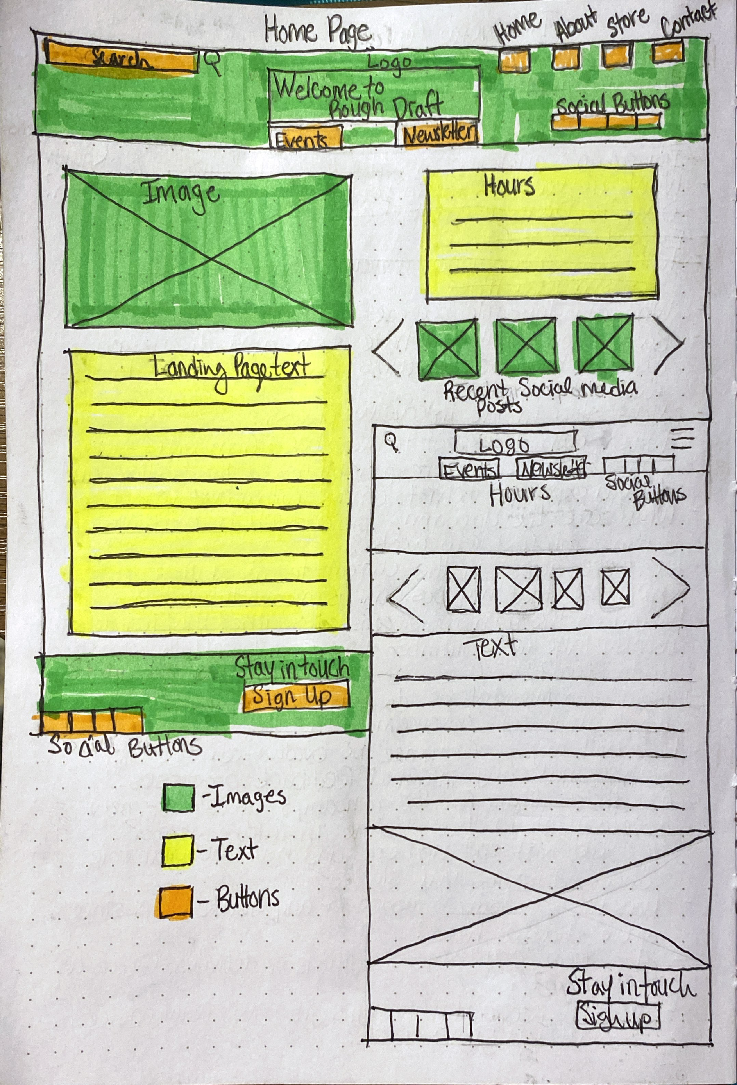
The proposed layout also explored a centered business logo, with primary navigation links positioned toward the upper right, a search bar on the upper left, and newsletter and events links placed beneath the logo.
Improving Content Organization
Beyond the navigation itself, I considered how information should be presented within each section.
Shopping-related content needed clearer organization and more descriptive labels so visitors could better understand what they would find before selecting a link. Event information also needed a more accessible format that allowed visitors to understand upcoming activities without having to scroll through a long list.
These considerations informed the proposed use of clearer content groupings, more visible page elements, and an interactive calendar concept for the Events section.
Designing Around Visitor Goals
The revised structure was intended to support the different goals represented in the project personas:
Local visitors: Quickly find newsletter and membership information.
Visitors and tourists: Browse upcoming events and understand what is happening at Rough Draft.
Potential business partners: Explore products and locate contact information without navigating through unrelated content.
By organizing the website around these common goals, the proposed information architecture aimed to make important content easier to discover and reduce unnecessary navigation.
Wireframing & Low-Fidelity Design
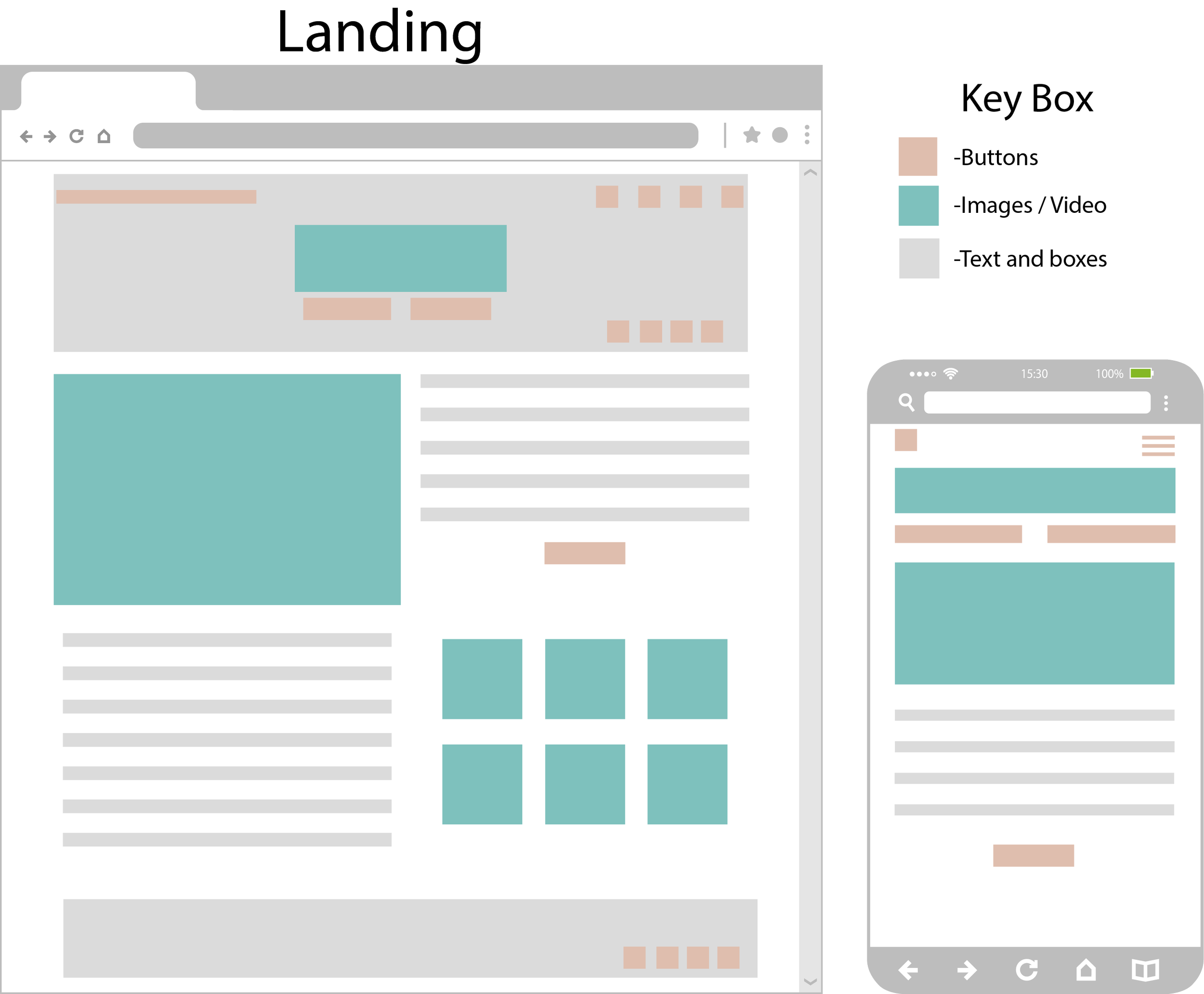
With the information architecture established, I moved into the wireframing stage to explore how the proposed website structure would translate into individual page layouts.
The goal was to create a more organized and visually balanced experience while making important information and navigation options easier to find. Rather than focusing on decorative elements, I concentrated on the placement of content, the relationship between imagery and text, and how visitors would move through the website.
Establishing the Layout
I began by exploring a revised navigation layout that would provide a clearer starting point for visitors. The proposed design placed the Rough Draft logo in the center, primary page links in the upper-right corner, and a search bar in the upper-left corner. Newsletter and Events links were positioned beneath the logo, while social media links were placed toward the lower-right area.
This approach was intended to create a more defined visual hierarchy and make frequently used destinations easier to recognize.
Balancing Imagery and Content
The homepage wireframe explored a larger photograph of Rough Draft's interior to give the business a stronger visual presence. I also considered how the written content could be broken into smaller sections and positioned alongside imagery.
This helped address the original site's excessive negative space, small images, and lengthy blocks of text. The objective was to make the page easier to scan while giving visitors a better sense of the atmosphere and services Rough Draft offered.
Applying the Structure Across Pages
I carried the revised layout approach into the other website sections, considering how navigation and content could remain consistent throughout the experience.
The page concepts explored how information could be presented more clearly, with particular attention to the Events, Store, Newsletter, About, and Contact sections.
For the Events experience, the proposed interactive calendar concept offered an alternative to relying solely on a long vertical list. The Newsletter concept also explored making signup information more prominent and providing a sample newsletter so visitors could understand what they would receive.
From Wireframes to Visual Design
The wireframing process established the foundation for the next stage of the project. By working through the placement and organization of content first, I could focus the visual design on strengthening the brand experience without losing sight of usability and navigation.
These concepts informed the progression from low-fidelity layouts into the more developed visual design.
Newsletter & Membership
An important part of the Rough Draft experience was building a stronger connection with its local community. The newsletter and membership offered visitors a way to stay informed and engaged, but the original website did not make these options easy to discover.
In my redesign, I explored ways to give newsletter and membership access greater visibility while making the signup experience more informative.
Making Signup Easier to Find
The original website placed newsletter signup information in less prominent areas, requiring visitors to search through the page or navigate to the Contact section to locate it.
I explored a more visible membership signup button and incorporated newsletter access into the revised navigation and page structure. The intention was to reduce the effort required to find this information and make the opportunity to stay connected more apparent.
Showing Visitors What to Expect
The redesigned Newsletter page retained a clear signup area while introducing a sample newsletter beneath it. This gave visitors a preview of the type of content they could expect to receive after subscribing.
I also incorporated a larger image of Rough Draft's interior to create a stronger visual connection to the physical space and help balance the page layout.
Connecting the Digital Experience to the Community
These design decisions were intended to make the newsletter more than a simple signup form. By improving visibility, providing a preview of the content, and incorporating imagery that reflected the business, the page offered a more welcoming way for visitors to stay connected with Rough Draft.
Responsive Design
A consistent experience across desktop and mobile devices was an important consideration throughout the Rough Draft redesign. The original website presented several usability challenges on smaller screens, where navigation and content organization made it more difficult for visitors to find the information they needed.
My evaluation identified an inconsistency in the mobile navigation, which used a dropdown arrow instead of a more recognizable menu icon. The Events page also presented challenges for mobile visitors, with a vertically stacked list that required considerable scrolling and offered limited visibility into upcoming activities.
Improving Mobile Navigation
I explored a clearer navigation approach using familiar interface conventions to help visitors understand how to access different sections of the website. The goal was to make essential destinations easier to recognize and reduce uncertainty when navigating on smaller screens.
Making Content Easier to Explore
Content hierarchy was another important consideration. Large blocks of text, small imagery, and excessive scrolling made it difficult to quickly understand what Rough Draft offered.
The proposed design emphasized a better balance between imagery and written content, with information organized into more manageable sections. This approach was intended to make the experience easier to scan and understand across different screen sizes.
Supporting Mobile Event Discovery
The Events page presented a particularly important opportunity for improvement. Visitors using mobile devices had to scroll through a lengthy list to understand what was happening throughout the week.
I explored an interactive calendar concept that would provide a more accessible overview of upcoming events and give visitors a more direct way to explore available information.
A More Consistent Experience
These considerations informed the proposed redesign by prioritizing recognizable navigation, clearer content hierarchy, and more accessible ways to explore the website. The overall objective was to make Rough Draft's digital experience feel more intuitive and cohesive, whether visitors accessed it from a desktop or mobile device.
High-Fidelity Design
With the layout and information architecture established, I moved into the high-fidelity design phase to bring the proposed Rough Draft experience to life.
The visual direction focused on creating a more welcoming and engaging digital presence that better reflected the character of Rough Draft as a bookstore, café, bar, and community gathering space.
Bringing the Concept to Life
The homepage brought together several of the design decisions explored throughout the project. A simplified navigation area incorporated recognizable search and menu icons, while the Rough Draft logo remained a central part of the visual identity.
Prominent Events and Newsletter links gave visitors more direct access to two important areas of the website. A larger interior photograph helped establish a stronger connection to the physical space, while the introductory content provided context about the business and its offerings.
Visual Hierarchy and Content
The design continued the goal of creating a better balance between imagery and written content. Rather than relying on lengthy blocks of text and small supporting images, the proposed layout gave photography a more prominent role and organized information into a clearer visual sequence.
The intention was to help visitors understand what Rough Draft offers while making important content and navigation options easier to recognize.
A More Welcoming Digital Experience
The high-fidelity concept brought together the project's primary design priorities: stronger visual hierarchy, clearer navigation, more prominent imagery, and improved access to events and newsletter information.
Together, these decisions established a more cohesive visual direction for Rough Draft's proposed website redesign.
Final Design & Design Outcomes
The final design concept brought together the project's central objective: creating a more cohesive, welcoming, and intuitive digital experience for Rough Draft.
Building on the earlier evaluation and design explorations, the proposed redesign focused on improving how visitors navigate the website, discover information, and connect with the business.
A Clearer First Impression
The homepage concept placed greater emphasis on Rough Draft's identity and atmosphere. Prominent photography, a more intentional content layout, and clearly positioned navigation options helped establish a stronger visual introduction to the business.
Easier Access to Important Information
The proposed navigation gave greater visibility to Events and Newsletter, while incorporating recognizable search and menu icons. These decisions addressed earlier concerns about navigation clarity and the difficulty of locating important information.
A More Engaging Content Experience
The design direction emphasized a better balance between imagery and written content. By giving photography a more prominent role and organizing information into more manageable sections, the proposed experience aimed to make the website easier to scan and explore.
Connecting the Website to the Business
Ultimately, the redesign concept sought to better communicate what makes Rough Draft distinctive: its combination of books, coffee, drinks, and community events. The visual direction was intended to create a digital experience that felt more connected to the atmosphere visitors encounter in person.
Project Outcome
This project translated a usability evaluation into a proposed website redesign, supported by personas, user scenarios, information architecture, low-fidelity wireframes, and a high-fidelity homepage concept. It demonstrates how visual design and UX principles can work together to identify usability concerns and develop more intentional digital experiences.