

Arcadia Park
Responsive Website Design & Development
Bringing the outdoor retail experience to the screen.

Project Overview
Arcadia Park was a responsive website design and development project centered around creating an outdoor retail experience. The goal was to combine an engaging storefront aesthetic with an intuitive shopping experience, making it easier for customers to explore products and discover equipment suited to their interests and activities.
The Design Approach
I began by researching established outdoor retail websites to explore their visual language, content organization, and navigation patterns. This research helped shape a design direction that balanced product-focused imagery, editorial content, and straightforward navigation.
I wanted the desktop experience to feel like a traditional outdoor retail storefront while maintaining a clean, approachable interface.
Designing the Experience
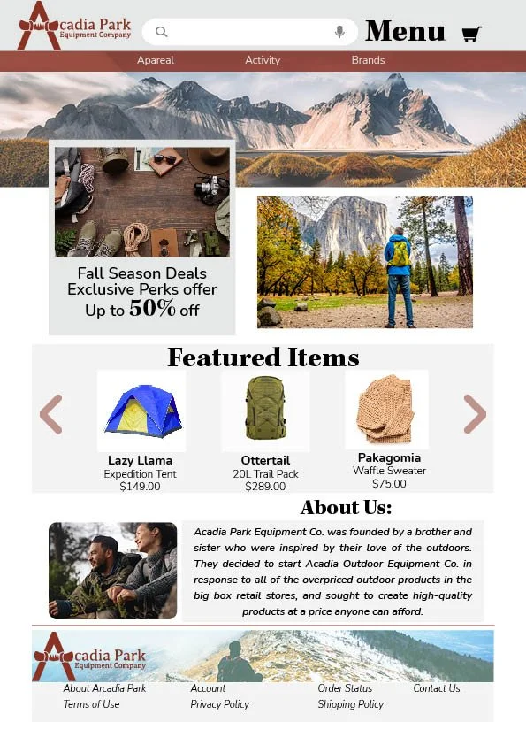
Product discovery became a central consideration in the site's structure. Rather than organizing outdoor equipment primarily by gender or age, I explored navigation centered around seasons and activities, reflecting how customers might approach choosing equipment for their next adventure.
To create a more engaging browsing experience, I incorporated product displays, video content, and interactive elements such as search and account features.
Adapting for Mobile
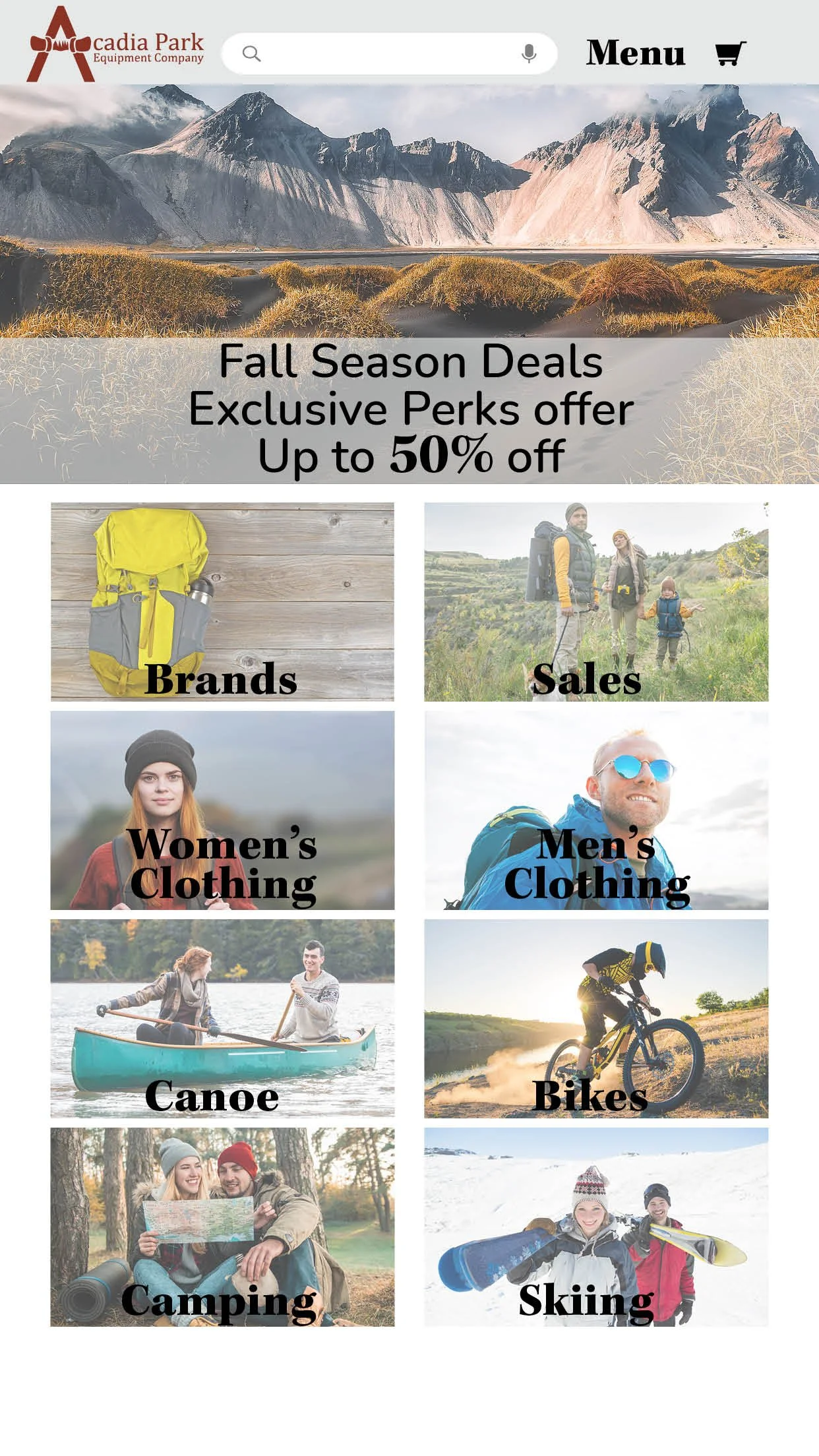
The mobile experience required a different approach. I simplified the layout and navigation to prioritize the most relevant content and reduce visual clutter.
By focusing on activities, seasons, and accessible navigation, the mobile design aimed to make finding relevant products more straightforward across smaller screens.
Development & Refinement
Bringing the design to life involved translating the visual concepts into a working website using HTML, CSS, and JavaScript. I worked in Adobe Dreamweaver and Visual Studio Code, developing page layouts, navigation components, interactive features, and responsive behaviors.
Throughout development, I tested the experience across different screen sizes and refined elements such as image positioning, navigation, and interactive components to improve consistency between the local development environment and hosted website.

The Outcome
The project brought together visual design, responsive web development, and user-focused content organization in an outdoor retail website experience.
It strengthened my understanding of how design decisions translate into development, and how thoughtful navigation, responsive layouts, and functionality work together to create a more accessible digital experience.
Project Details
Project Type: Academic / Conceptual E-commerce Website
Focus: Responsive Web Design & Development
Tools: HTML, CSS, JavaScript, Adobe Dreamweaver, Visual Studio Code
Disciplines: Web Design, UI Design, Front-End Development